Thursday, February 27, 2014

pasty and pearly it is (SSS, PTI)

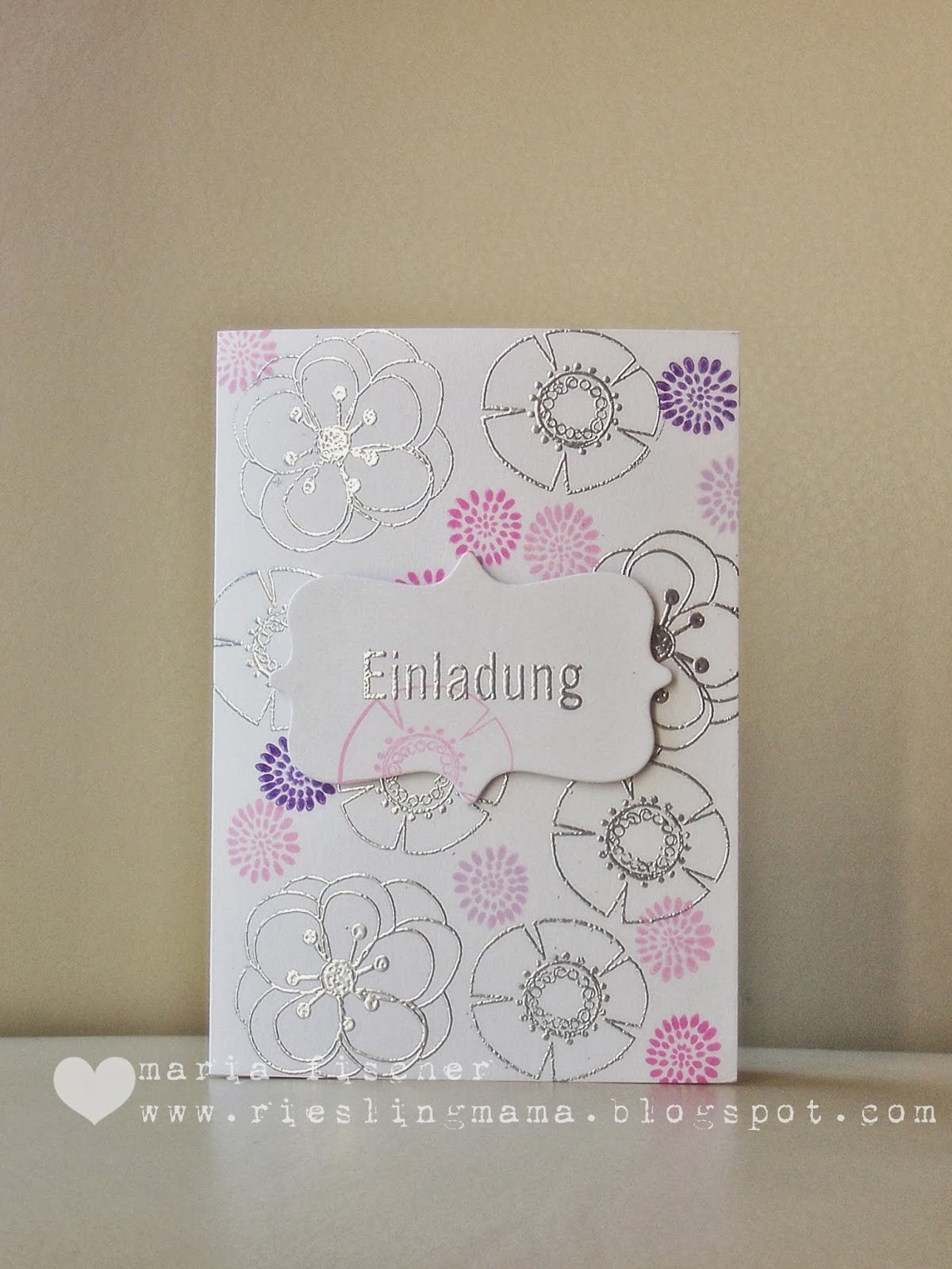
I'm so excited.  My friend asked me to make the invitations for her daughters' confirmation. (These are the gals I had come over for some post-WCMD cardmaking!)  She picked a card of mine that she liked and asked for pinks and purples with silver instead so I got to it.

This was numero uno.


Structure paste applied through a stencil. Stamped squares along the bottom and die cut letters on a vellum strip. But then I thought about heat embossing a  feather stamp with silver powder.  So along came numero dos.


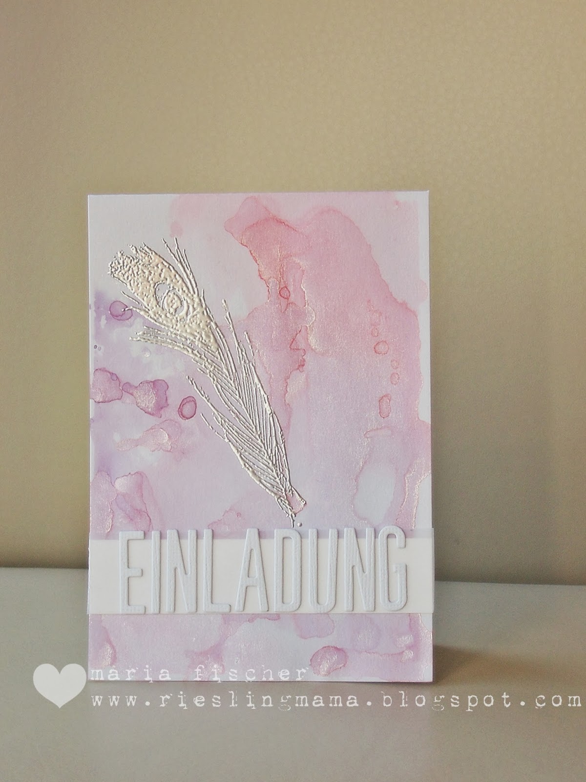
Created a watercolor background using Distress Inks on a craft sheet spritzed with lots of Perfect Pearl water. And then, wondering what feathers have to do with confirmation, I decided to give her a more traditional option, numero tres.


I'd love to know which you would pick.

I'm joining these challenges:
Simon Says Monday Challenge - Paste with numero uno
Simon Says Wednesday Challenge - Pearls with numero dos
Papertrey Make it Monday - #153 with numero dos

Thanks for looking.  Happy almost weekend.  And to my German friends... wolle wir se reinlasse?!?!?

Friday, February 21, 2014

1,2,3... smile (STAMPlorations, ABNH)

So many roads lead to Rome... How do you like to achieve the oh-so-trendy watercolor look?  With good old-fashioned watercolors?  With stamps that look like brushstrokes? With patterned paper that looks watercolored? With mists? Dye inks used like watercolors?

I love the technique of applying Distress Ink to an acrylic block, misting it and then smooshing the block onto CS.  Like on my hello card in this post. There's always that one nice blob of water that leaves one nice blotch.  My artsy fartsy crafty heart just loves that.


So my heart, which also loves rainbows in any form, put down a few acrylic blocks of misted Distress Inks, stamped over them with a camera image from Amy Tangerine's Aspire stamp set and stitched on some teensy alpha stickers from KI Memories.

Stamping? check. Stitching? check. That's the theme of February's challenge at STAMPlorations:


Join us for the fun - you have all month.  While you're there, check out the bi-weekly sketch challenge too. Shery is so generous with her prizes.  Play along.

I'm playing at A Blog Named Hero too.  #38 is all about ROYGBIV.  Love that guy ;)

Keep your eyes peeled -  this card is in the Paper Crafts Stamp It! Techniques Vol. 2 ;)


Supplies for 123 smile:
Paper:  white CS Bringmann
Stamps: American Crafts
Ink : Distress inks
Tools: acrylic block, sewing machine
Other: alpha stickers KI Memories


Monday, February 17, 2014

STAMPlorations sketch #6

There's a new bi-weekly sketch over at STAMPlorations.  Lovin' this one.


I got pretty stuck on the literal.  Give me a circle and I'll nearly always take a circle ;) Here's my take.


Tried my hand at a variation on spotlight stamping.  First I pencilled roughly where I wanted to die cut the circle, then I stamped and embossed the graphic images from VIGNETTE: Chevrons and Arrows on the black panel. Die cut it then made some pencil marks to line up where I needed to stamp the black images on the cardbase.  TIP: Don't cut your panel until after the stamping is done.  You may need to tweak here or there.  See the angled panel?  It was born after I ended up having to angle the black panel a bit to make both stampings line up. So I angled it a lot :)

While you're here, take a gander at the sneak peek of the next sets scheduled for March release at STAMPlorations.  The new line is called SUBWAY ART BUILDERS.


There are two stamp sets up for grabs over at the STAMPlorations blog.  Check it out here.

Would love to see what you come up with for STAMPlorations Sketch #6.  Give it a shot.  Thanks for coming by.


Supplies for hello:
Paper:  CS Bringmann
Stamps: STAMPlorations
Ink : Versamark, Versafine
Tools: die MFT
Other: Zing embossing powder


Friday, February 14, 2014

simply create too 55 (st. patrick or green )


Happy Love Day.  But forget the red and pink. It's time for a new challenge over at Simply Create Too.  This time Challenge #55 is about St. Patrick's Day/Use Green.  I've not a lot of use for St. Patty's cards so I went green. And yes, I like Kermit.


My background is a piece of tracing paper that I used to sop up excess spray ink when I was having some fun with stencils.  I have a large piece of backing from contact paper that I keep on the bottom of the cardboard box I use when spraying.  It catches the excess but because it's plastic-y it doesn't absorb and I can sop the ink up with scrap paper.  This time I misted the ink with water first to dilute it, then soaked it up.  Amazing results - although you never know for sure what you will get with this technique.


After adhering it to a blue cardbase, I applied clear modelling paste through the Crafters Workshop Rain stencil and added a tiny bit of gold glitter to it before it dried.  Subtle, but effective.  Computer generated a sentiment to fit the mood of the card.

I'm joining the talented ladies at CASology this week where the cue is BOLD.  Yep.

Feeling green?  Simply create too!


Supplies for brighter days:
Paper:  cardbase Bringmann, tracing paper
Stamps: PC-generated sentiment
Ink : Dylusions spray inks in turquoise and green
Tools: stencil Crafters Workshop
Other: modelling paste, gold glitter

Thursday, February 13, 2014

your special day (Wplus9)


Birthday celebrations going on over at Wplus9 with some great challenges and great prizes.  I just love the products.  (Finally got the Fresh Cut Florals set but am petrified to use it for the first time.  SO MUCH gorgeousness out in blogland with this set.  What's left to do?)  Anyhoo...

This week's challenge is to "Step it Up" - or add dimension.  I went with some freestyle collage-ing. Now I do NOT have the light hand of Debby H.  Or Danielle F. But I gave it a try.


Oh man does Blogger make photos ugly - looked fine in Photoscape.  They must have a special app that puts a gray film over every photo...

Well, lots going on here. A panel of textured CS that I stencilled structure paste onto through an alpha stencil from Ben Franklin! Then some watercolor splotches onto it -a couple on the card base too to peek out  from the left of the panel.  Some banners from PP and vellum.  A sentiment heat embossed in white onto vellum cuz that's the only way to go these days! A section of a doily.  A paste dragonfly (applied through a piece of CS punched to create a stencil).  Some messy stitching. And did you catch the Wplus9 Folk Art Florals birdhouse roof doubling as a photo corner?

How's that for steppin' it up?

Play along.  Dawn has fun guests sharing their designs over on the blog this week too.


Supplies for your special day:
Paper: CS  Bringmann, CS American Crafts, PP Kesi Art, vellum Ursus, scraps
Stamps: Wplus9
Ink :watercolors, Versamark
Tools: stencil, die Wplus9, sewing machine, dragonfly punch
Other: doily, structure paste

happy love day (PTI)

Still celebrating with Papertrey during the 7th Anniversary party week.  They are bringing out a cool stripe cover plate and I love me some stripes.  Check out the cards Nichole made.  Made me run to my craft room and play with Kesi Pschhiitt spray inks (they are opaque) and a mask.  And I realized I still hadn't made a Valentine for DS.


On the "love" front he's had a bit of a rollercoaster ride this past year.  Hard for a mom to watch.

OK, did you catch my faux pas? There ain't no PTI on this card.  Ha!  Just realized as I was attaching labels to the post.  Back to my craft room.

Ta daaaa.


Took me five minutes to get the foam adhesive unattached... but easy call to pull out PTI Live Love Life and add the striped chevrons.  Changed the red and shape of the heart too.

Thanks for visiting.


Supplies for happy love day:
Paper: CS  Bringmann, coral Amuse
Stamps: 
Ink :Kesi Art
Tools: heart die Sizzix, stencil Studio Calico, corner rounder EKS
Other: foam adhesive, Sharpie

Tuesday, February 11, 2014

pti 7th anniversary roundup (PTI)


No one throws a party like PTI.  Compliments to the crew! I could barely keep up with all the challenges.  Not with blog posts anyway.  I did get some cards made and thought I'd compile them into one post for ya.  Sit back and scroll...

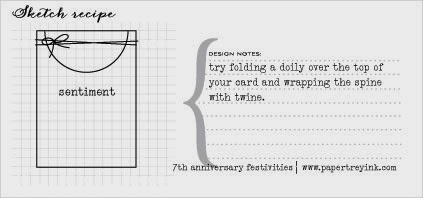
Day 1.  Combine a color and sketch recipe.


 And this set of gift tags for a friend...


Day 3. A timed challenge (yeah, feel your blood pressure rise).  But it was no problemo cuz I picked another color and sketch combo and it was "easy peasy" (I don't say that often, but it really was). Under 10 minutes even for this masculine birthday card.


Day 4. OK, so PTI realized that there is a lot more money to be spent in the Project Life world - or the Monthly Moments as the new line is called.  And this could be a problem for me cuz 1) I could almost imagine dealing with the smaller formats and pockets instead of bulky scrapbook pages and therefore start playing with these products and 2) I'm lovin' the fonts Heather chose for the line and lots of the products are card-able...

So, back to the project at hand.  Make a 3x4" flat card, basically a larger ATC.  OK.  I needed some Valentines for some lovely ladies who sent me wonderful Christmas cards (read: nope, I didn't get around to sending them Christmas cards).  So, get out the freebie printables from Day 2, punch 'em up and make some 3x4" washi shakers (nod to Julie E.) to adorn the Valentines. TIP: Put something like a wood veneer into your shaker to keep the confetti flowing.  Julie told us that, but I forgot. My confetti is kinda lazy :(

Oh, and why not use another color/sketch combo...


See?  The speech bubble is the round element, the blue heart the bloom and underneath... the sentiment. And then I nodded to the sketch again when making the cards...


The shaker is the round element (just not off the edge), the popped up speech bubble the bloom and the sentiment underneath.  Yep, you now know who one of the nice ladies is... but you already knew that didn't ya ;) And may I also say, Maile B., I'm happy you have a bouncy new baby girl, but I'm sad you're not designing any new stamps for me in the near future.

Day 6. A word.  Use a stamped or die cut word as the main element in a card.  Don't have to ask twice.  Lately I've been lovin' me the PTI hello die.  Here 'tis again.


Did some dip-dying of watercolor paper for this.  Used an old plastic container, with water and half of a watercolor paint chip in it.  Held on to my panel and the die cut with a clothespin and dipped. And dipped.  And dried.  And dipped. Crazy, I know. But that's one way to get ombre!

Enough already.  Be back at ya with more later in the week if I get a ROUNDTUIT.  Have a good one.


Monday, February 10, 2014

WCMD 2013 winner birthday category (PTI)


Maybe you've seen the March 2014 issue of Paper Crafts and Scrapbooking?  The cards which were chosen as World Card Making Day (WCMD) winners last October are included in this issue.  Which means I get to share with you the card of mine that was chosen.  Still can't believe it.  I'm sure they just needed a blue card to sit next to Vera's beauty!


So what's so special about this card? Heck if I know.  It's a striking stamp and a cool font on the sentiment - thanks to PTI. And the ombre turquoise colors are pretty - thanks to Inkadinkado.  And Tsukineko's Delicata gold ink, well it is pretty yummy.  The only thing interesting is perhaps that I raised the small strip on the left instead of the larger panel on the right. Seriously, I'm just saying all this to encourage YOU to submit cards if you're at all inclined, cuz you just never know!!!!

And get this.  I sent in three cards (cuz hey, Operation Write Home is a great organization to support, right?), seriously thinking if any card had a chance, it would be this one...


You're only getting a sneak peek cuz one day - when the challenge is right (tee hee) - I'll be hooking it up.  But, I'm certain you agree... this wouldn't have looked good next to Vera's ;)))

Anyhoo, watch for a blog hop among the WCMD 2013 winners coming soon.  We are all making cards using some of the goodies from the amazing prize package to show our appreciation... And there may be prizes too ;)))

Now ya'll know that Papertrey Ink is celebrating 7 years of business gone well.  As part of the celebration, there are daily challenges and today you are to make a bday card for Papertrey.  Well, I didn't really make this for that occasion, but thought there was no better time than the present to share it over at Papertrey!

Happy anniversary, PTI and many more.


Supplies for birthday wishes
Paper: CS  Bringmann, white Neenah, turquoise DCWV
Stamps:  PTI
Ink : Inkadinkado pigment and Delicata gold
Tools: 
Other: foam adhesive

Sunday, February 9, 2014

pattern-tastic (CMBC)


Not too long ago I was complaining that challenges were disappearing from blogland and now it seems a plethora of new ones are popping up.  I can't keep up!

If you didn't know Taheerah A. before, you certainly got to know her during the farewell blog hop for Cath of Moxie Fab. That mammoth operation would not have gotten off the ground without Taheerah's efforts. Well, have you seen Taheerah's latest endeavor - Cure for the Monday Blues Challenge? Some of the most gorgeous inspiration photos like this latest one:


Not to mention the killer cards that girl creates for her own challenges and the other design teams she has taken by storm. I'm finally playing along (this is already CMB #3) with a card I made for a submission call.  Species "reject" but I think it fits the bill here perfectly.  And I spent way too many minutes deciding on the arrangement of my focal image which is somehow Taheerah-esque.

Here 'tis:


Used the Simon Says Stamp Diagonal Stripe Stencil, but only in one quarter of the card front, and a sponge dauber to ink the stripes in Chipped Sapphire, Salty Ocean and Broken China. Rotated 90 degrees and repeated. Then I slopped on some modelling paste through a Crafters Workshop chevron stencil. Then I added that funky ikat PP circle (why? no clue but once I'd tried it I couldn't not do it!) before adhering the shadowed gold glimmer Papertrey Hello die cut.

Enough patterns for ya?!?!?  Are your eyes wonky now?!?!?

Thanks for a great new challenge, Taheerah. And the rest of you should play along in the next one. Here's hoping you don't get the Monday blues to begin with ;)))


Cardstock: (cardbase) Buttinette,  (navy) American Crafts, (bronze metallic) DCWV 
Patterned paper: (ikat from Print Shop) Studio Calico 6x6
Dye ink: (chipped Sapphire, Salty Ocean, Broken China Distress Inks)
Dies, embossing folders, brass templates: (Diagonal Stripe stencil) Simon Says Stamp, (Chevron stencil) Crafters Workshop, (hello die) PTI
Tool: (spatula), (circle punch) EKS

Other: (white structure paste)  

Saturday, February 8, 2014

hip hip hooray for ric (RIC, SSS, Neat and Tangled)


Ready for a threefer?  I wasn't.  It just happened. (And I didn't even make a card using my first idea!)  Meet the Temperly London dress from Runway Inspired Challenge #53.


Whoa! Definitely going to a party.  Definitely shimmery. Very symmetric, yet organic. That's what I got at least.  Oh, and Antique Linen, Picked Raspberry and Peacock Feathers with black accents (Did you notice that glove???) Even if you don't play along, you must check out the DT cards. Extraordinaire, they are.

Meet hip #1.


I LOVE this.  Pun intended.  I've got this older Kelly Panacci stamp set, Love, and it's got the greatest images.  This one caught my eye for this card.  Back up... Flubidoo caught my eye.  Did you see her gorgeous creation for this challenge - the pink and purple distress inked panels?  Knew I had to do that.  And why not paired with bronze/glitter Zing? Screamed "artsy fartsy" image to me. Which brings us back to the Love set.

So, distress inking (spritzed with bronze Perfect Pearls for the coolest shimmer) plus heat embossed image just wasn't doing it.  My inner Aga thought about a Dymo label. But just the Dymo strip wasn't enough.  Enter the PP strip (discovered as I was searching for a folklore type print) and red heart.  Still wasn't enough, thus the "photo corners" with an organic edge.

Meet hip #2.


To mimic the symmetric but organic blooms outlined with black, I heat embossed with a floral BG stamp on Neenah CS and colored with Distress Inks in abovementioned colors. Die cut the sentiment from CS and backed it with a strip of the BG. The plain CS just wasn't doing it... had to add some inks and Glimmer Mist to make it party-worthy. And some jumbo sequins - why not?

So, ready for the party? Meet hooray.


This card happened cuz as I was looking for my purple sequins for hip #2, I stumbled across these sequins and they screamed "party banner" to me.  Which led to the "celebration" idea which led to the Neat and Tangled Party Dots stamp set.  Some Wink of Stella shimmer on the dots and voila.

OK, I'm done.

Well, hip #1 is also joining the fun at:
Simon Says Monday Challenge - Love Notes
Simon Says Wednesday Challenge - Have a heart 
Little Tangles - Celebrate Love

Thanks for visiting.


Supplies for LOVE:
Paper:  cardbase The Paper Studio, Neenah CS, black scrap, PP DCWV
Stamps: Kelly Panacci
Ink : Distress inks, Versamark
Tools: heart die Amuse, Dymo
Other: bronze Perfect Pearls, bronze/glitter Zing embossing powder

Supplies for danke:
Paper: black and violet CS Bringmann
Stamps: BG CHF
Ink : Distress inks, Versamark, plum Glimmer Mist
Tools: alpha die MFT
Other: sequins

Supplies for let's celebrate:
Paper: CS Bringmann
Stamps: Neat and Tangled
Ink : Distress inks, Versamark
Tools: label die MFT
Other: sequins, crochet thread


Friday, February 7, 2014

STAMPlorations february challenge "stamps and stitches"

It's time for a new monthly challenge at STAMPlorations.  This month's theme is "Stamps and Stitches" (as in machine-stitched, hand-sewn, stamped or made with a pen - your choice!).


This is what I did.


Unfortunately, I needed a sympathy card.  And I wanted to submit a card for the Native American feature of a submission call.  So I found this Tuscarora proverb, printed it out, stitched the paper to a cardbase and then stamped over the words with the brushstrokes from STAMPlorations Holiday Artsy clear stamp set echoing a rainbow.  My technique was generational stamping of Distress Inks misted with water.  I die cut some WPlus9 Clouds, inked the bottom edges with gray and adhered them.

Not publishworthy cuz... I'm guessing the too-dark brushstrokes or the too-small font or the wonky stitching. But it's off in the mail to, I hope, bring a tiny smile to my girlfriend's face.

Thanks for visiting.  Check out the other Stamped and Stitched cards from the DT and then play along.  There are prizes to be won, folks ;))

The February challenge winner will get:
1 package of Nantucket Wood Shapes (Pink Paislee), 1 package of Mixed Half Circle Chipboard Banner Album (Maya Road), 1 package of Winter's Roses - Aquamarine (Maya Road), 1 package of  Tranquility Sunflower Metal Slides (Maya Road), and 1 package of Mulberry Paper Flowers.


Supplies for Tuscarora proverb:
Paper:  cardbase The Paper Studio
Stamps: Stamplorations
Ink :Distress inks
Tools: sewing machine, cloud die WPlus9
Other: PC


Thursday, February 6, 2014

simply create too 54 (mother or female)


Here's a card for ya fitting the current Simply Create Too Challenge #54 - Mother's Day or For a Female.  I was in the mood for Dylusions spray inks and went with the girly colors.  Put your sunglasses on.


Stamped Madame Nautilus from Paper Artsy Lynne Perella Collection 001 onto a die-cut tag and heat embossed her.  I masked her and sprayed with yellow, then "painted" her with some of the pink spray and my waterbrush. 

You're probably in the midst of Valentine preparation, but don't let Mother's Day sneak up on ya!  Simply create, too!


Supplies for dare to be different:
Paper: cardbase Bringmann
Stamps:   Paper Artsy, sentiment Rubbernecker
Ink :Versamark, Versafine, Dylusions spray inks
Tools: die MFT
Other: washi Bella Blvd

Wednesday, February 5, 2014

twofer contrast (Wplus9, PTI MIM)

Pink, green, hand-lettering. Probably what you see when devouring Wplus9's Monday Mood Board #26.


I picked up on the embossed sentiment in a pool of watercolor and that snippet of PP up top.  See the Xs and Os?

Well, Dawn is also celebrating Wplus9's 4th Birthday with a "Comfort Zone" challenge. So I combined the two.  Heat embossed a sentiment made from die-cut craft foam and played with watercolors = comfort zone.  Pink and pearls, well that's more Mood Board ;)


So the first card pretty much turned out as it looked in my mind's eye (wouldn't that be a great name for a paper crafting company? - *wink*).  It's actually cream, we have gray skies so this was the best photo I could get. You have to look closely but you can see tiny pink flowers and green leaves that I stamped on the cardbase with watercolors.  Oh so soft!  And do you remember enamel dots' great-grandmother, pearls?

For my next card I feel compelled to share the journey that led to its creation...

Now, I've been a crazy person in my craft room lately as two submission deadlines came to pass (why does it always take me so long to get my butt in gear, or better, my ideas?) So yesterday was an update the blog, the flickr gallery and check out my reader kinda day.  Which led to my seeing not only the Wplus9 shindig but also the latest Make it Monday at Papertrey - #151 Drop Shadow Die Cuts.

I've been using that technique lately with the PTI hello die and decided to peruse my dies to see if I could do it with a different die.  I was thinking "thank you" (debossed all over the card front and shadowed on one in the sweet spot).  Well then I saw the speech bubble die and my mind went to a shadowed speech bubble and a sentiment along the lines of "many thanks".  And these would be neon speech bubbles cuz neon paper is still laying around waiting for me to put it away. And for some reason, I pictured a little birdie tweeting the sentiment.  Heat embossed white on black, cuz neon works well on black.  Hmmm. So off to see what little birdie stamps I have from PTI.  And sentiments about a lotta thanks (this is where Darnell's stamps-organized-by-theme theory would come in real handy...)

So picture this.  In a course of a few seconds as I'm flipping through my PTI stamps, I see a thank you sentiment in my NBUS Take Three: Spring set.  And then the little bunny image from that set catches my eye (my mind's eye that is) and the card design takes on a life of its own.  Neon speech bubbles shadowed and a white embossed bunny.  Hmmm. Where to put a sentiment?

Didn't like the idea of stamping on a speech bubble, and did a bunny have a lot to do with "thanks"? Nay. Bunnies are Easter. OK, it's gonna be a black Easter card. (Black?) With the sentiment subtly stamped in the BG with Versamark.  Which didn't really work on the black CS I used so I quickly added some clear powder and heat embossed it. But the bunny was a keeper.

And a card was born.


BTW, "shadowed " took on a new meaning as you can see. Cuz when I had die cut the speech bubbles and was playing around lining them up, I laid them down on the card which popped open thereby leaving them in a bit of a jumbled  "shadow".  Which I decided I liked.

Moral of the story? Don't know.  But after often spending countless hours on one card for submission in the past week, last night I created two that I'm happy with in one hour. I've said this before, but I love how cards "happen". At least sometimes.

Got a fun creative process blog post to share?  Link me up.  I'd love to see how other great minds work ;)))


Supplies for XOXOX:
Paper:  cream CS Bringmann
Stamps: Wplus9
Ink : watercolors, Versamark
Tools: die Wplus9, paint brush
Other: lace, thread, pearls

Supplies for happy Easter:
Paper:  black Bringmann, neon Grafix
Stamps: PTI
Ink : Versamark
Tools: dies PTI, corner rounder
Other: clear and white embossing powder

Related Posts Plugin for WordPress, Blogger...